Restaurant Menu Design
What makes a great menu design?
We’ve been designing menus as part of our restaurant branding work for over 12 years, and having recently reviewed old and current designs, we thought we’d collate all our favourite designs in one blog. But before we start with the actual examples, it’s worth delving into what goes into a great menu design, the thought process behind the different artistic decisions, as well as the customer psychology behind some of those decisions.
A key element of any menu design is first understanding the business. Is the restaurant quick service or fine dining, does the concept need a fast turnaround of tables or does the client want more dwell time? Is it advantageous to include some text about the concept, the cuisine, the cooking techniques and the heritage of the dishes or chefs? A lot of design decisions are made by the concept itself.
Positioning
In some ways, colours will be governed by the concept – a Caribbean restaurant, for example. Typically, it won’t use muted or black-and-white tones. The interior design plays a part, as does what the client likes. For a more in-depth look at colours, take a look at our Colour Psychology Blog.
Colours
Fonts need to be easy to read, especially if a restaurant has low lighting in the evening or an older demographic. Fonts are an easy way to quickly communicate the brand’s key fundamentals; for example, modern, classical, family-friendly, or cuisine from a particular country like India or China.
Fonts
Those dishes that make a restaurant unique are the ones that really need to be made prominent within the menu design. The eye must be drawn to them and given a mouth-watering description. The use of colours, graphics, font sizes and boxes all helps to draw attention and ensure they get the promotion they need.
Layout – Signature Dishes
For concepts which are original as well as those that have a particular story drawn from culture and/or heritage, a menu introduction is a great way of communicating what the brand is all about. A short paragraph helps to educate guests on traditional cooking techniques, seasonality and highlight suppliers of note.
Intro
Traditionally, companies tended to price items at, say, £4.99 rather than £5.00, although there’s only a 1p difference; psychologically, people associate £4.99 with £4 rather than £5. A modern trend in menu design is to remove the £ sign in favour of just a number – there is some evidence to suggest the £ has negative connotations, and without it, customers will pay more for a dish.
Descriptions – Pricing Psychology
The restaurant positioning will largely govern the menu format; after all, a QSR won’t have menus printed on expensive paper, and fine dining restaurants obviously don’t want menus on TV screens. Obviously, the number of dishes also plays a big part in the menu format.
format
Restaurant Menu Design Examples:
Spice Shack
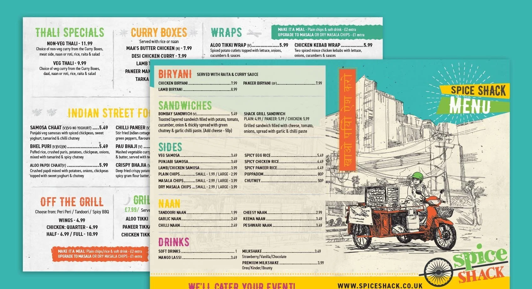
Spice Shack serves amazing Indian street food. The business started from a food truck, and as the business grew to brick-and-mortar sites, it needed a rebrand. A key part of our branding work was creating a stunning new menu. The front cover really communicates the Indian street food origins of the business and the dishes served. The eye is drawn to the Grill items and other signature dishes. The menu is easy to read with lots of white space and colourful fonts. For more details, please visit our Spice Shack restaurant branding case study page.
Papa-Dum
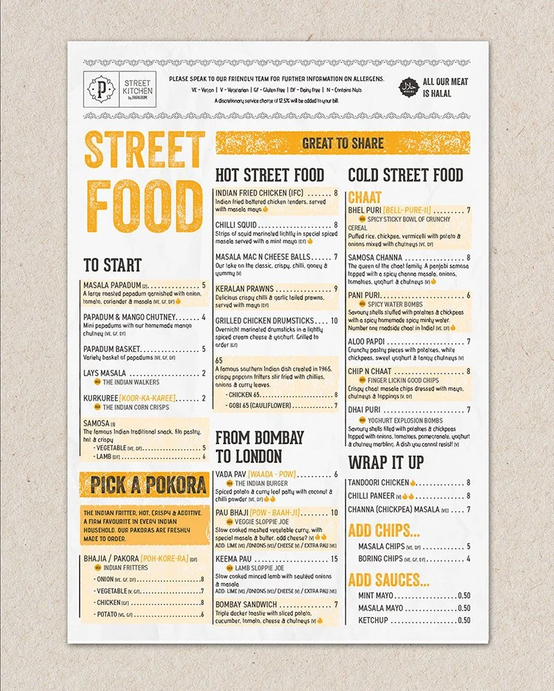
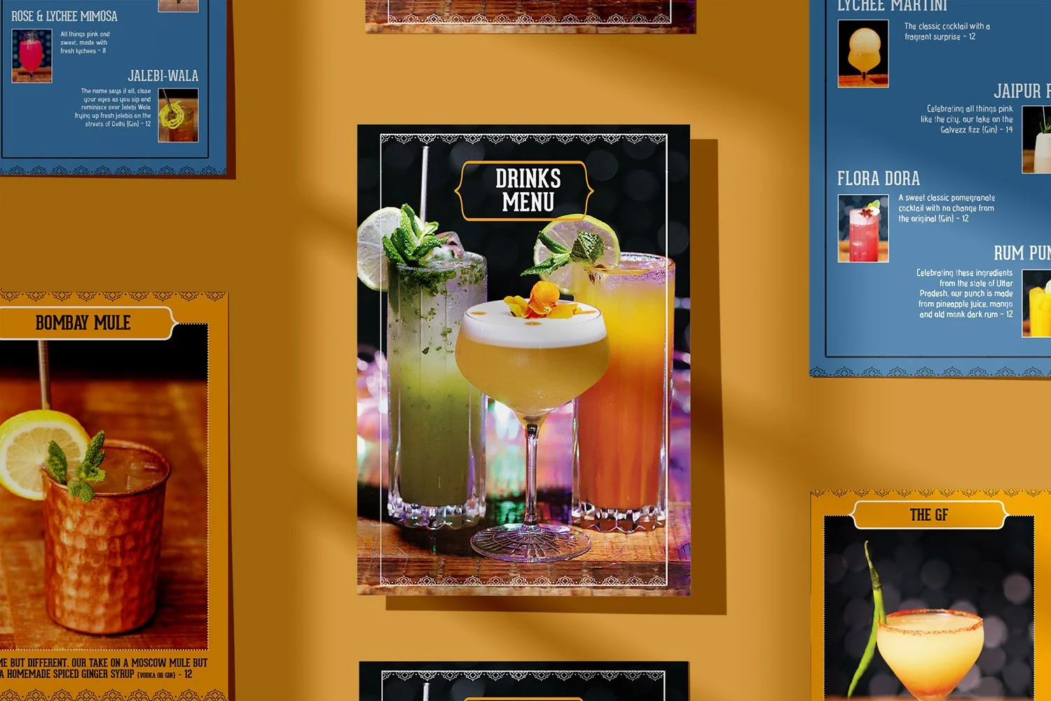
To help with the next stage of growth, Papa-Dum wanted to redesign the menu to incorporate new dishes as well as upsell certain sides. Popular dishes like the grill section were made more prominent, as well as giving nicknames to traditional dishes which British customers may not be familiar with. One area which we identified for growth was cocktails – they are very visible on the existing menu and really help increase the spend per head. We took them off the main menu and created a stand-alone cocktail menu which sat on the tables at all times, which resulted in a lot more being sold.
Double Dragon
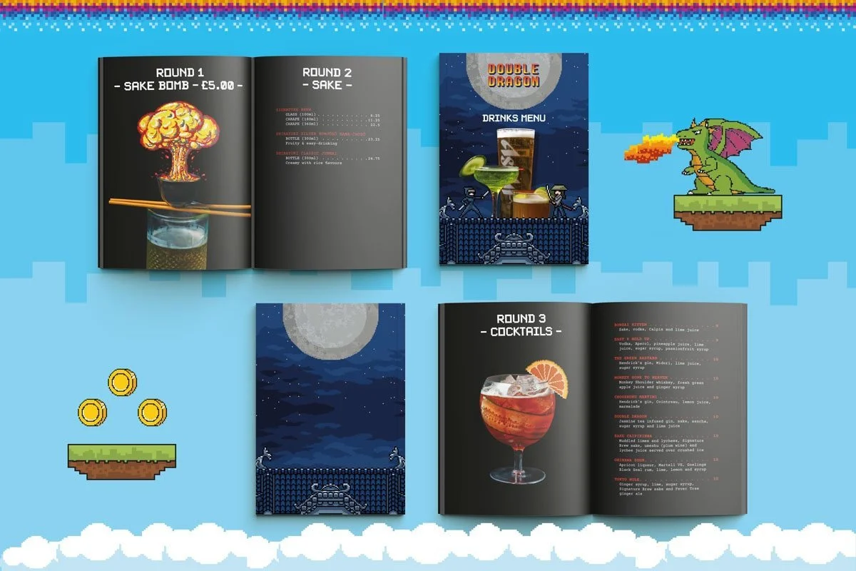
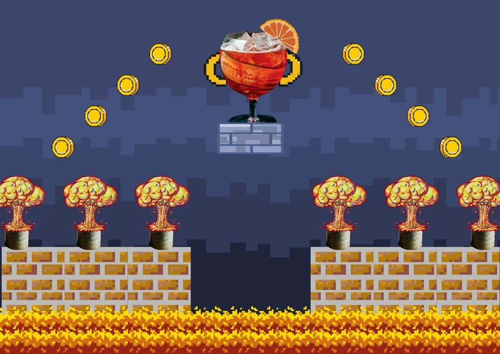
Named after the 1980s video game and with a brand design heavily influenced by pixelated gameplay, the drinks list was a continuation of that theme. For the cover, we briefed the photographer on the shots we wanted – ie photos of a number of drinks shot from the side rather than the top. These were then added to a graphic game play scene. In the menu itself, each section was divided into Rounds, and as Sake Bombs were a particular drink the client wanted to promote, we gave them their own page with a pixelated explosion above the sake cup. The restaurant kept having to reprint the drinks list as customers were taking them as mementoes!
Indan Express
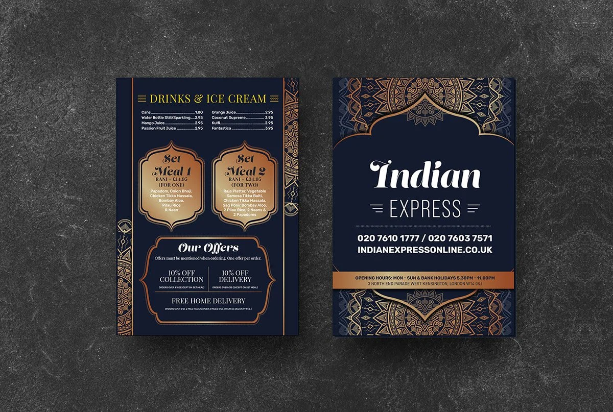
The client favoured a traditional, classic Indian design for their takeaway menu. We used Opulent colours of gold and navy blue for the main colours, and traditional Indian patterns and boxes were used to promote set meals and offers.
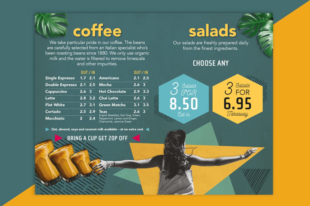
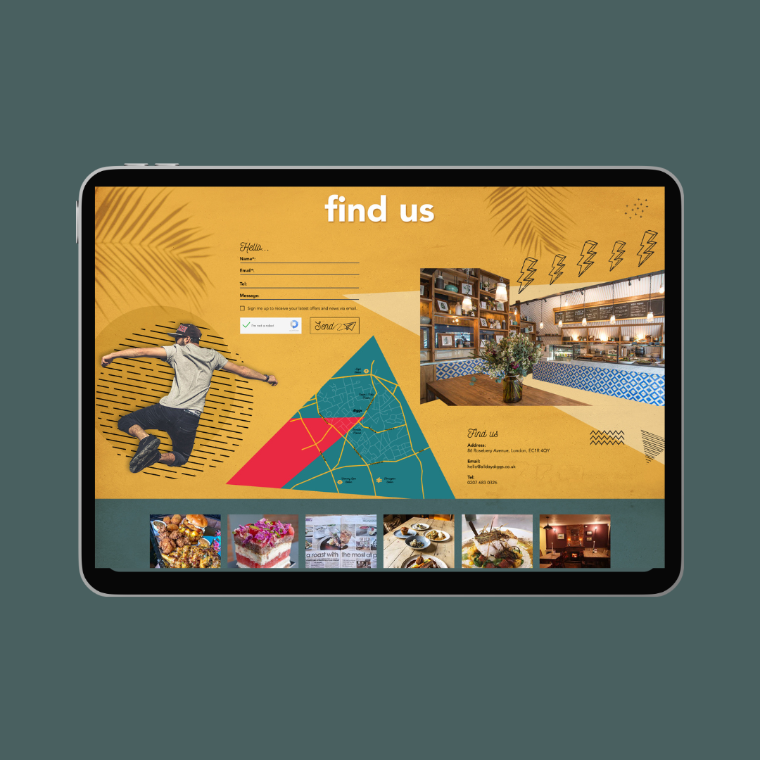
Diggs
Located in the heart of Clerkenwell, right by the very competitive Exmouth Market, all day eatery and coffee shop Diggs wanted a fun and vibrant brand which would translate across all their brand touchpoints. The menu was to be printed onto a large foam board behind the bar, so those queuing could quickly see what they wanted. Using collage, graphics and geometric shapes that created a distinctive design full of fun with a passion for healthy living. Visit the Diggs restaurant branding case study for more details.
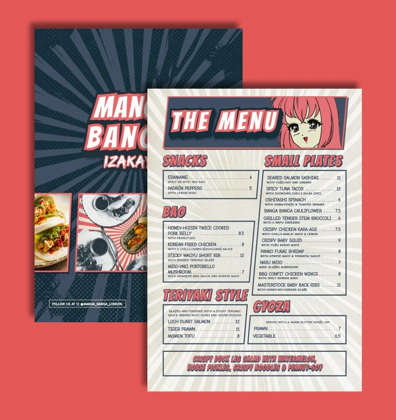
Manga Banga
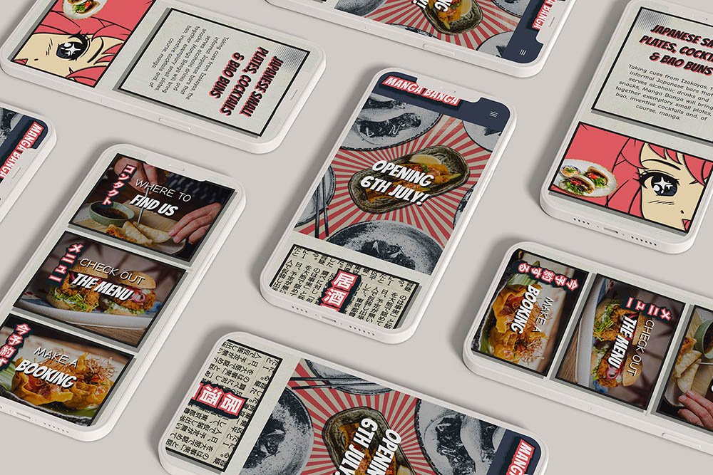
For the Japanese Izakaya restaurant Manga Banga the menus we designed were all themed on anime and manga. We created a fun, distinctive menu design and as the lighting was always low in the restaurant, the fonts were bigger and a light background used. Some Japanese characters were also used to reinforce the authentic Japanese dishes. Check our the Manga Banga restaurant branding case study for more details.
Antipodea – Mother’s Day Menu
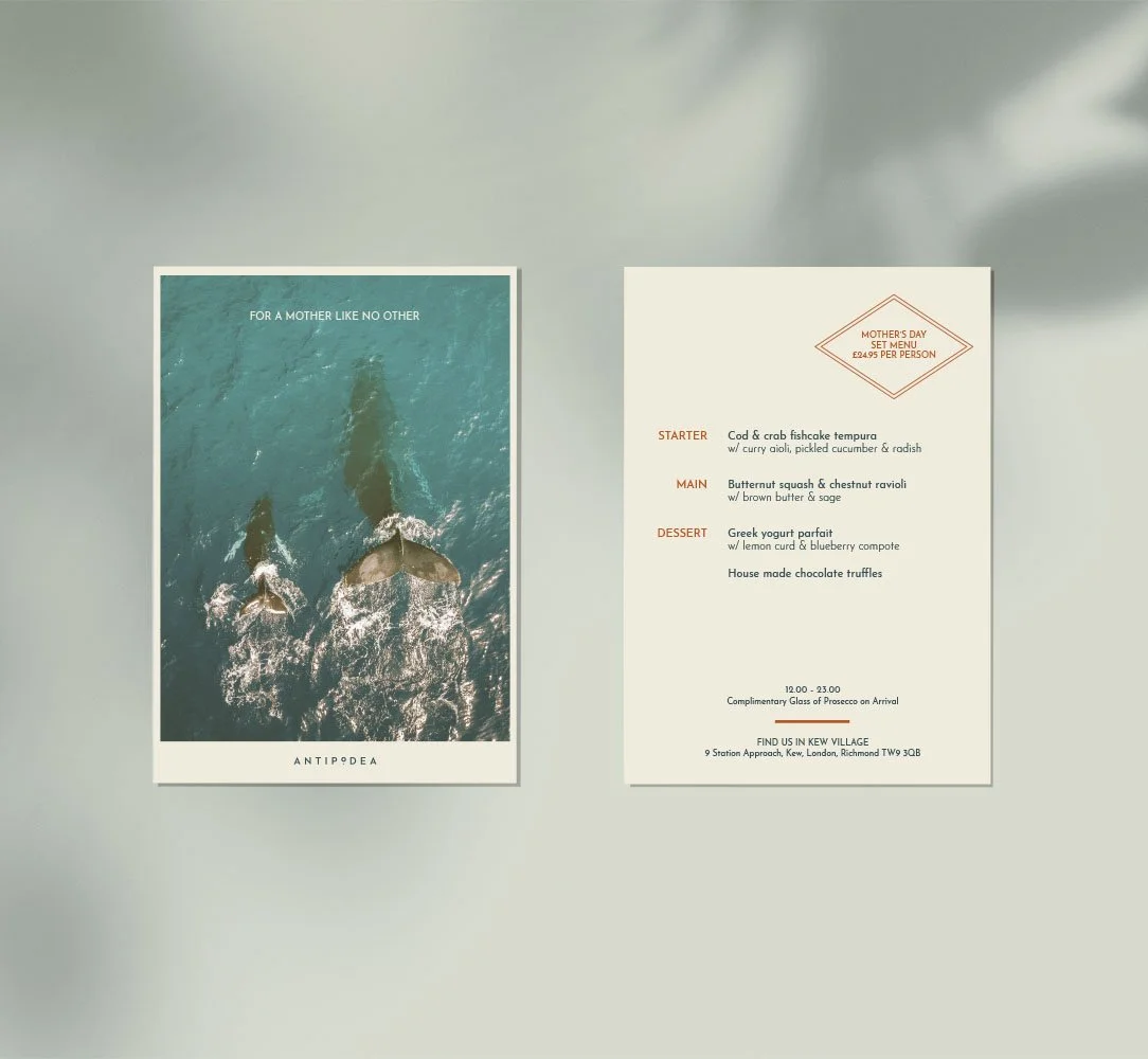
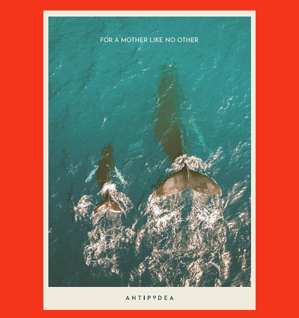
All-day Australian brasserie evolves throughout the day and effortlessly morphs from laid-back breakfasts to sumptuous lunches and a bustling night-time dining spot. It needed a design for its Mother’s Day set menu, and our team used a striking and on-brand stock image of a whale and her young, beautifully complemented with a simple layout and muted fonts and colours.
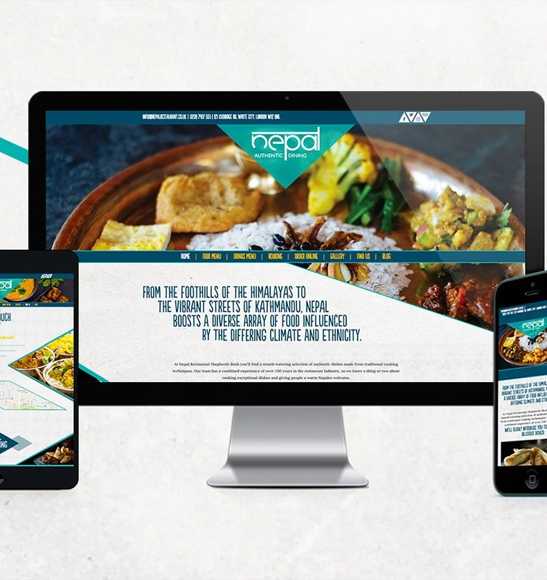
Nepal
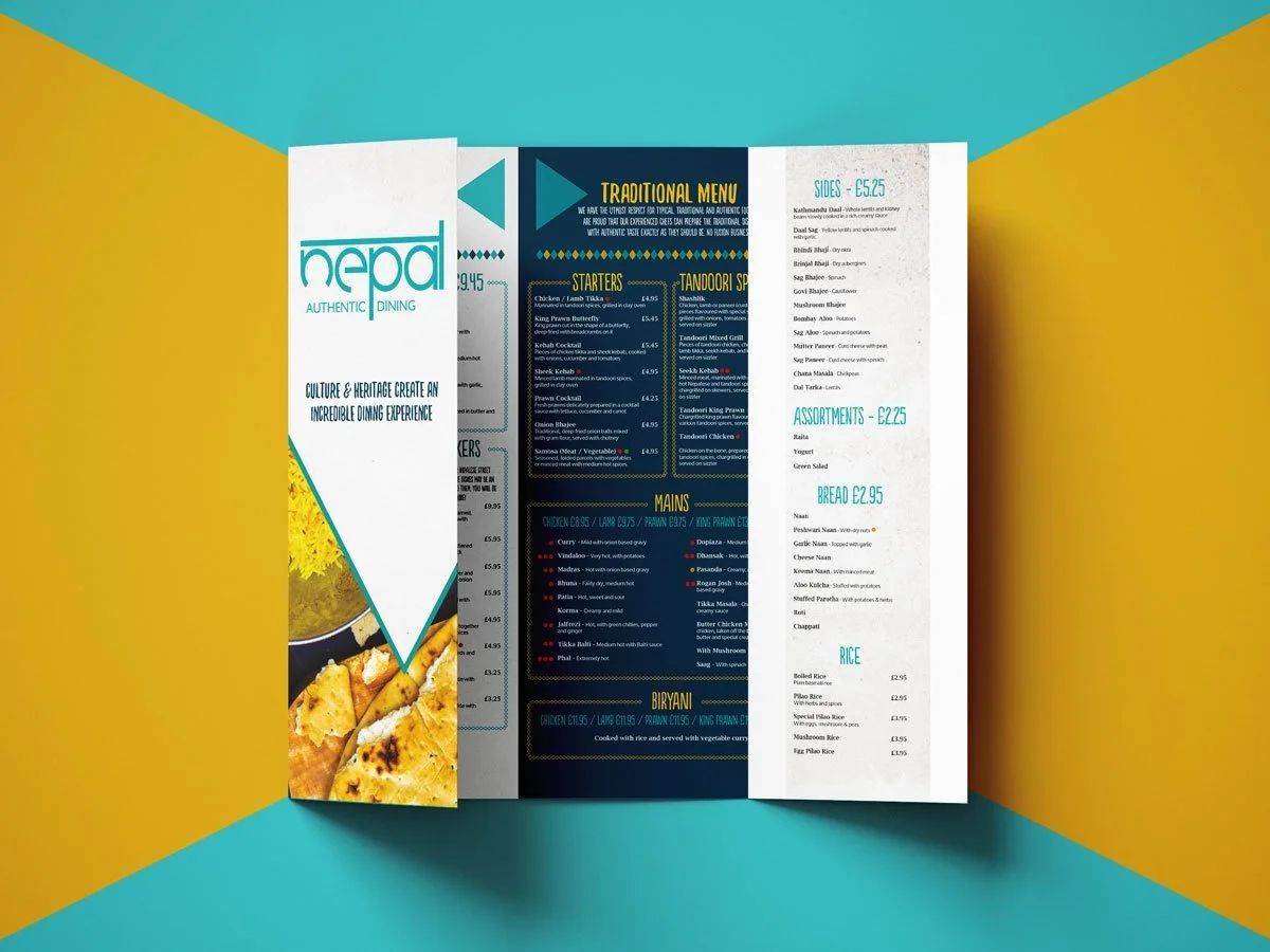
For London’s first Nepalese restaurant, Nepal, we created a restaurant brand which used the Himalayan peaks as inspiration as well as a vibrant colour palette. The restaurant serves a lot of dishes, and therefore the layout was very important. There are quite a few signature dishes which were added to a Traditional section of the menu and given a different colour so that section really stood out.